- Lightroom Presets
- Best Sellers
- Mobile Presets
-
Photoshop
-
Learn
-
Support
-
Install
- Blog

In this post, we will look at the differences between clarity and contrast, to help you know which one to use and when.
This post uses Adobe Camera Raw, but the same principles apply in both Lightroom and Photoshop.

Contrast and clarity both affect the tonal range of an image. While contrast affects the highlights and shadows of the entire image, clarity affects the midtones and local regions.
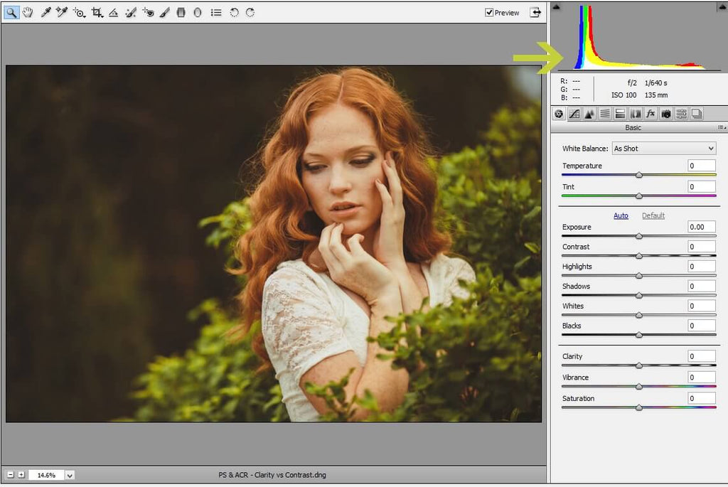
Let's use our histogram as a reference point for how contrast and clarity affect our image. Below is the histogram before applying any changes:
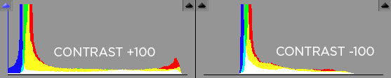
The contrast is now set to +100. By doing this, the highlights and shadows in the image are pushed as far as they can go, resulting in a histogram that is more spread out:
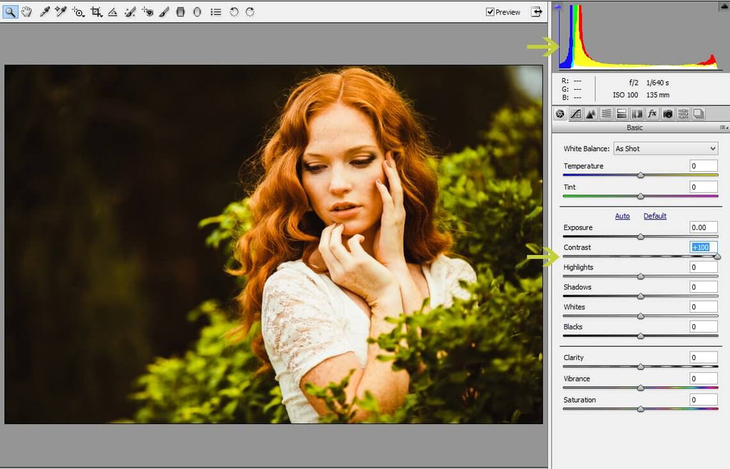
This is a typical high-contrast image, with a lot of definition between the highlights and shadows.
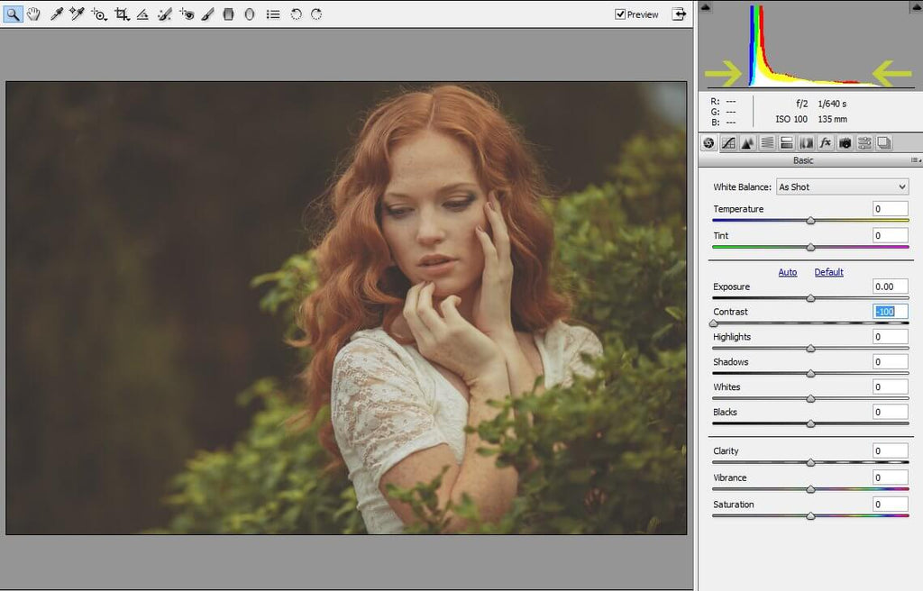
When we reduce the contrast to -100, we create the opposite effect: less definition between highlights and shadows, and a more condensed histogram:
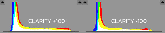
Instead of globally affecting the lights and darks in an image like contrast, clarity targets midtones and local regions. "Local regions" simply means specific portions of the image (ie - in this image, the edges of the leaves) rather than the entire image, which is referred to as "global adjustments."
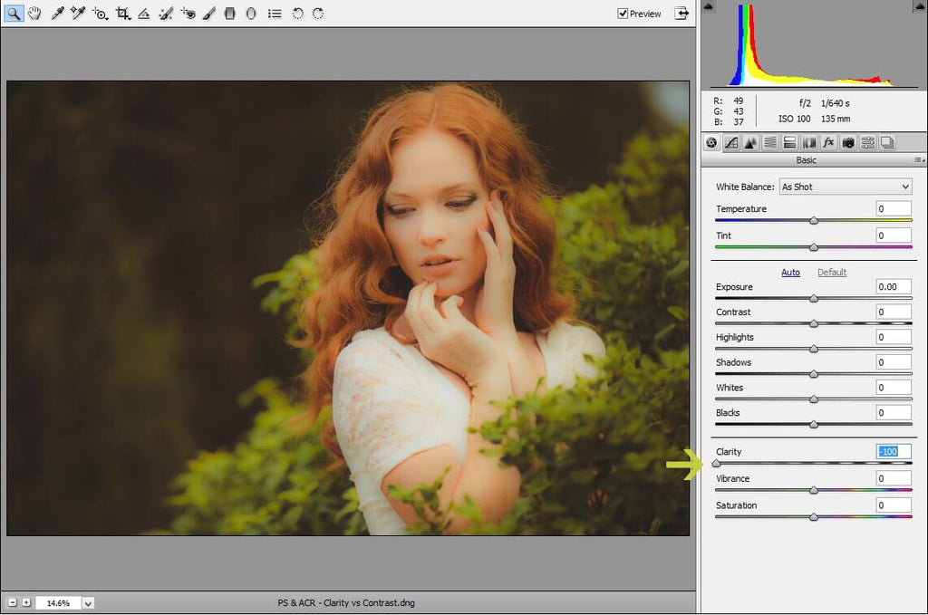
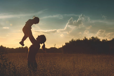
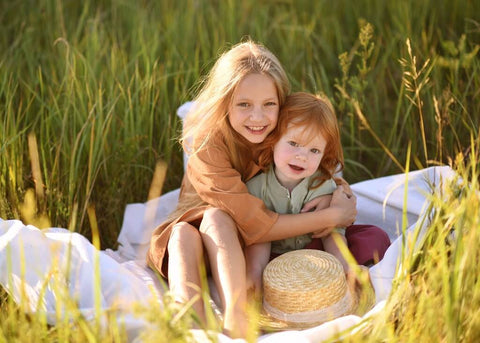
Here, the clarity is reduced to -100, which has significantly softened the images because it is targeting the midtones which can be found in the subject's hair, skin and clothes:
When the clarity is increased to +100, the image looks extremely sharp:
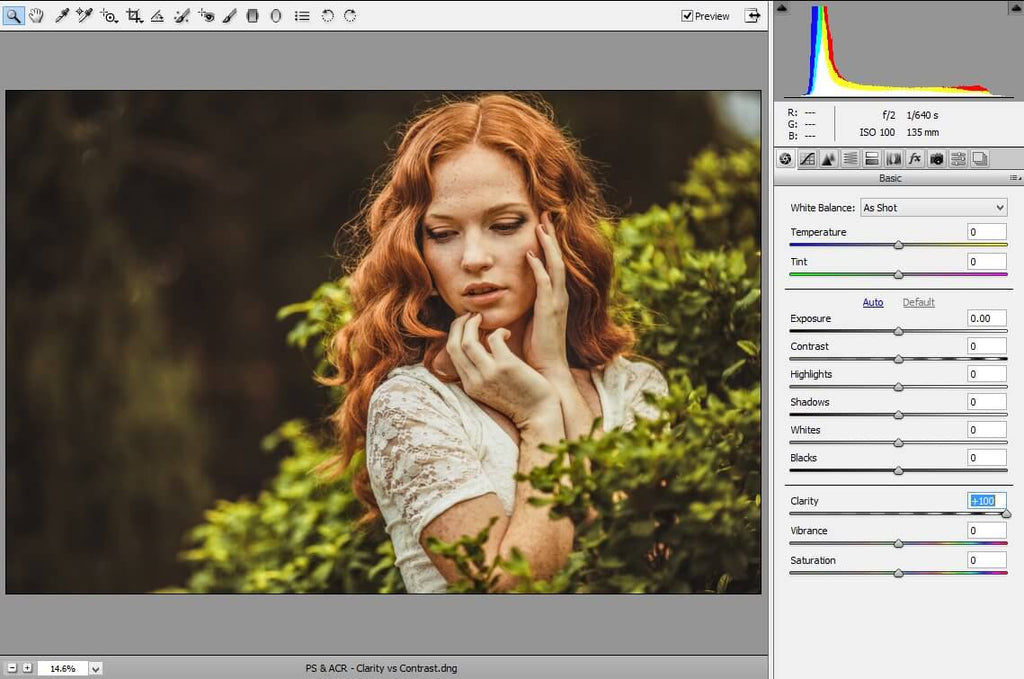
Clarity is a useful tool to soften portions of an image, such as skin, or give your image a bit more "pop" around the edges.
To sum it up: contrast affects the highlights and shadows (whitest whites and darkest darks) of an image. Increasing the contrast spreads the histogram out, whereas reducing the contrast makes the histogram more condensed:
Clarity affects midtones and targets local regions such as edges. Since clarity affects mostly midtones, you will see the majority of the histogram shift in the center, rather than the edges:
I put together this video, If you are a visual learner, to give you a real-time visual of how each concept affects an image. Watch below:
Are you looking for Photoshop Actions to help you achieve the perfect amount of clarity, contrast, vibrance and saturation? Look no further than our PURE Color Workflow!
Do you have any questions or comments about Clarity Vs Contrast? Leave us a comment below - we would LOVE to hear from you! And PLEASE SHARE our tutorial using the social sharing buttons (we really appreciate it)!


Comments